design advice
Intro to Color Theory
Here's a question. If you love designing with neutrals, do you love it because you really love it or because you're not sure what to do instead?
Some of you might actually love it. It's in your nature. For others, neutrals are the easy way out. The timeless option that won't get boring, overwhelming, or untrendy.
The vast majority of our clients love a neutral palette (as do we). But rarely do we find one who doesn't appreciate a pop of color, a pattern here, and a print there.
More often than not, it isn't a dislike of color that prevents them from branching out but a lack of clarity and confidence when it comes to doing it.
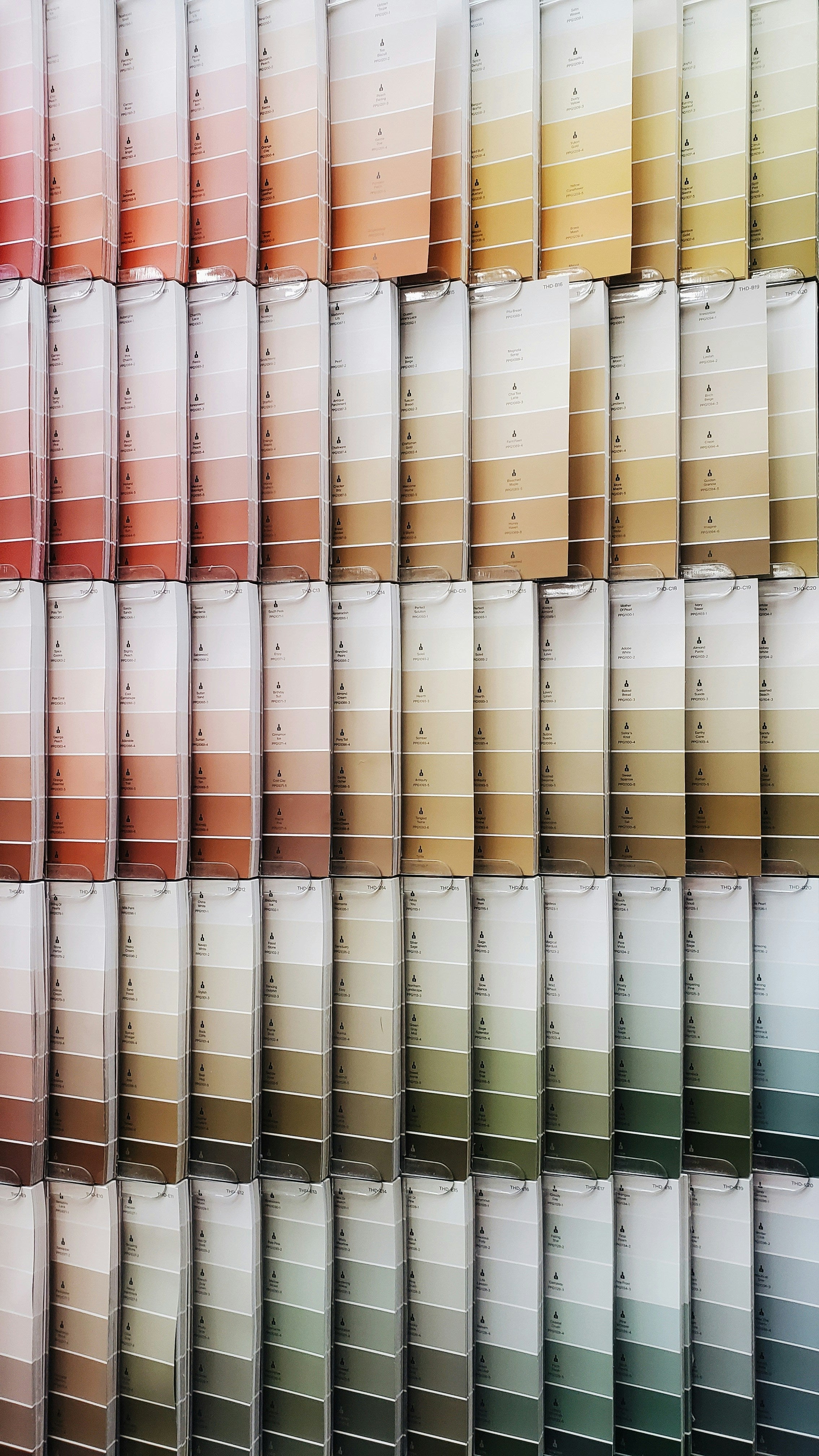
This is when understanding color theory becomes so helpful. It takes a literal rainbow of hues and provides a tested formula that, with practice, creates a timeless and well appointed space.
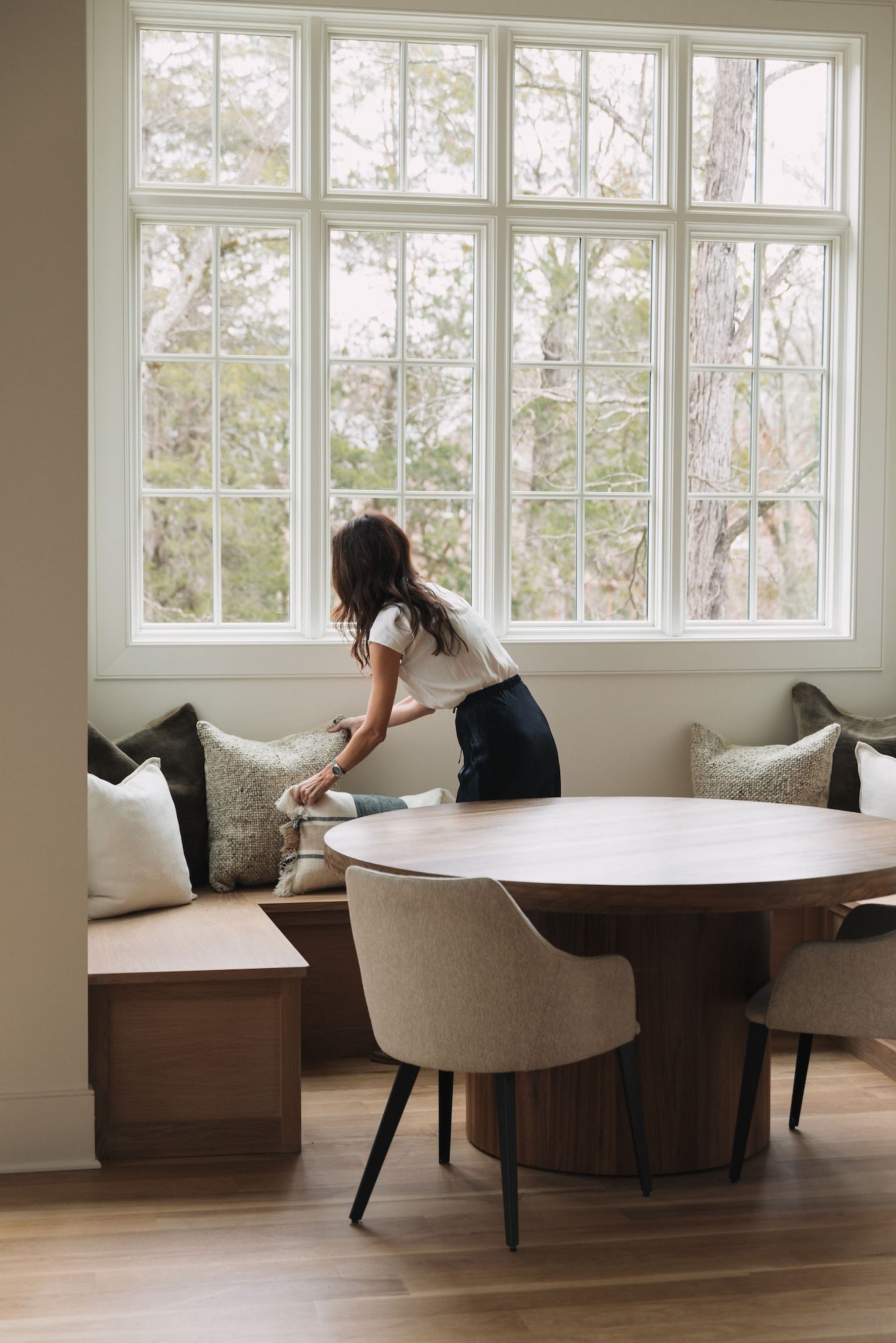
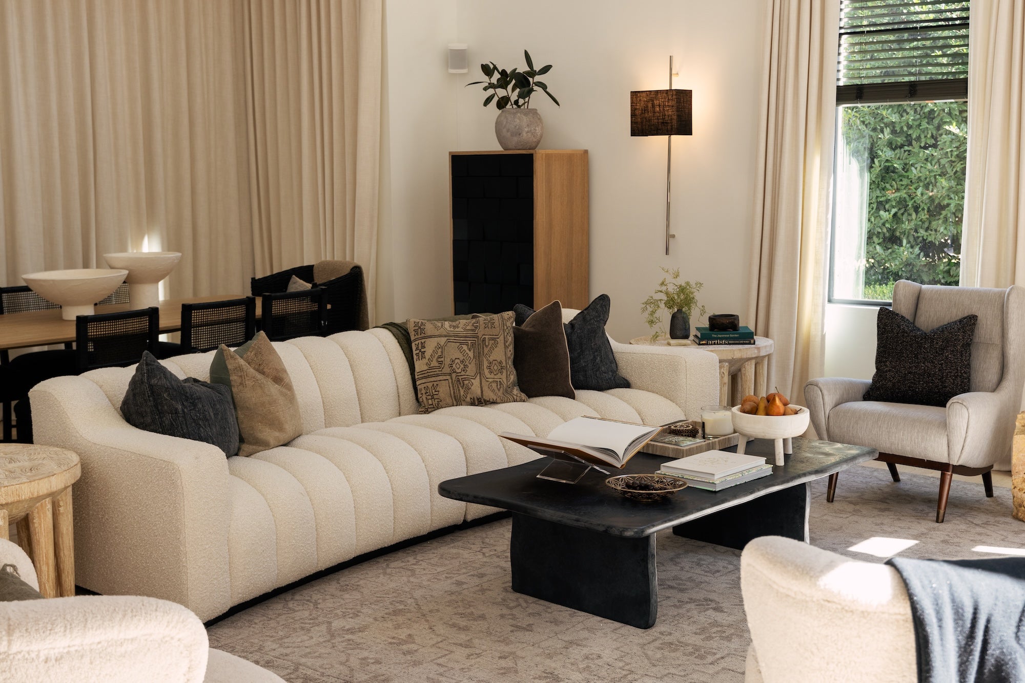
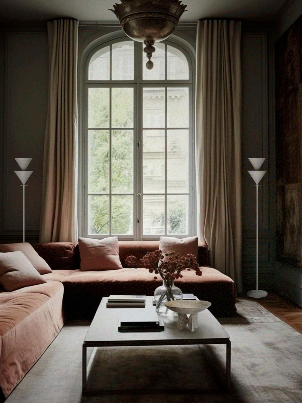
We love the way Christiane Lemieux has mastered the art of color. Her designs (pictured below) evoke drama and warmth, comfort and depth, subtlety and interest.
If you’re ready to dip your toes into the wonderful world of color, here’s some color theory to get you started.
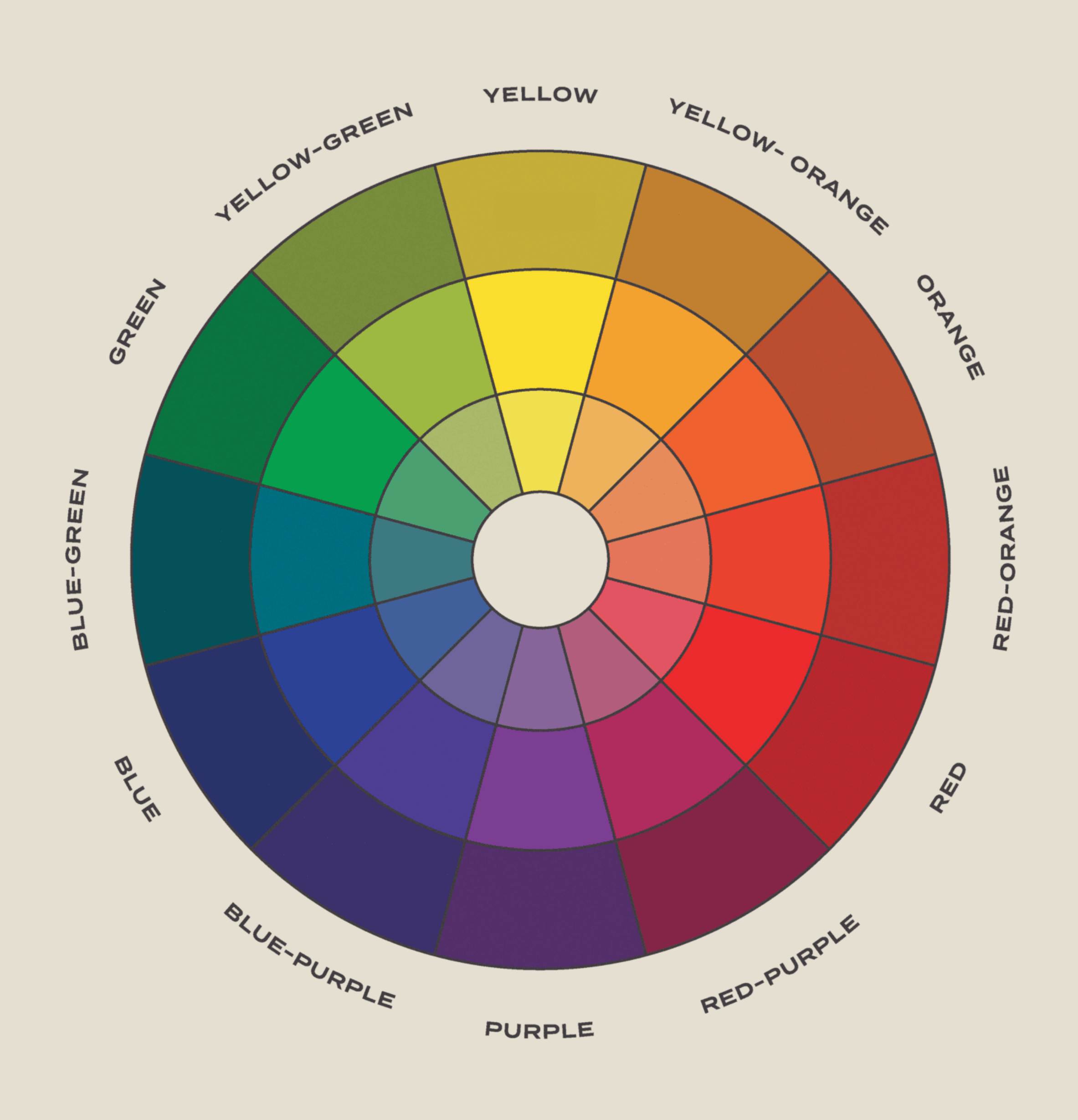
The Color Wheel
The Color Wheel (see below) is composed of three primary colors (red, blue, and yellow), three secondary colors (green, orange, and purple) and six tertiary colors (such as blue-green and red-orange).
Color Schemes
Color schemes are created by different combinations of colors on the wheel.
A complementary palette is created with two colors on opposite sides of the color wheel, such as yellow and purple.
A triadic palette is made up of three colors that form a triangle on the wheel. For example, yellow, blue, and red.
An analogous palette uses colors that sit next to each other, such as purple, red-purple, and red.
A monochromatic palette uses one color (or hue) in differing tints, shades, and tones. A tint is a pure color mixed with white, a shade is a pure color mixed black, and a tone is a pure color mixed with gray. For example: all of the greens on the color wheel.
Applying Color Theory
Here are a few tips to get you started:
- Pick one color that works in your space then look at your color scheme options.
- Think about the mood you want to create and let that guide your selections and proportions.
- Try the 60-30-10 decorating rule: Make 60% of the room one dominant color (off-white walls), 30% a secondary color (a moss green velvet sofa), and 10% an accent color (a rust-red throw pillow).
- Look out for a piece of upholstery, throw pillow, or drapery that uses most, if not all, of your colors in one go. That’s the detail that will tie it all together.