Color, Considered: How to Choose a Palette That Honors Both Style and Soul

Color is more than a backdrop. It's the undercurrent of a space—the tone-setter, the mood-definer, the detail that often whispers louder than any statement piece ever could. And yet, choosing a color scheme can feel paralyzing. The options are infinite. The stakes feel high. (Will I hate this green in six months? What even is greige?)
But in my years as a designer—and as someone who lives in a home filled with a toddler, coffee stains, and all the layered texture of real life—I’ve learned that the most enduring palettes are the ones rooted in intention. Not trend. Not fear. Not the pressure to get it “right.”If you want a home that feels cohesive and lived in (but still editorially worthy), here's how to approach color with both confidence and curiosity.
1. Start with Emotion, Not Aesthetics
Before you even touch a swatch, ask yourself how you want to feel in the space. Are you craving calm? Energy? A sense of grounding?
- For serenity, try chalky whites, warm greys, and softened greens.
- For creative energy, consider coral, ochre, or French blue.
- For a sense of moody intimacy, look to inky navy, deep plum, or olive black.
Color should serve the mood, not the moment. Let feeling lead.

2. Build Around a Hero Color
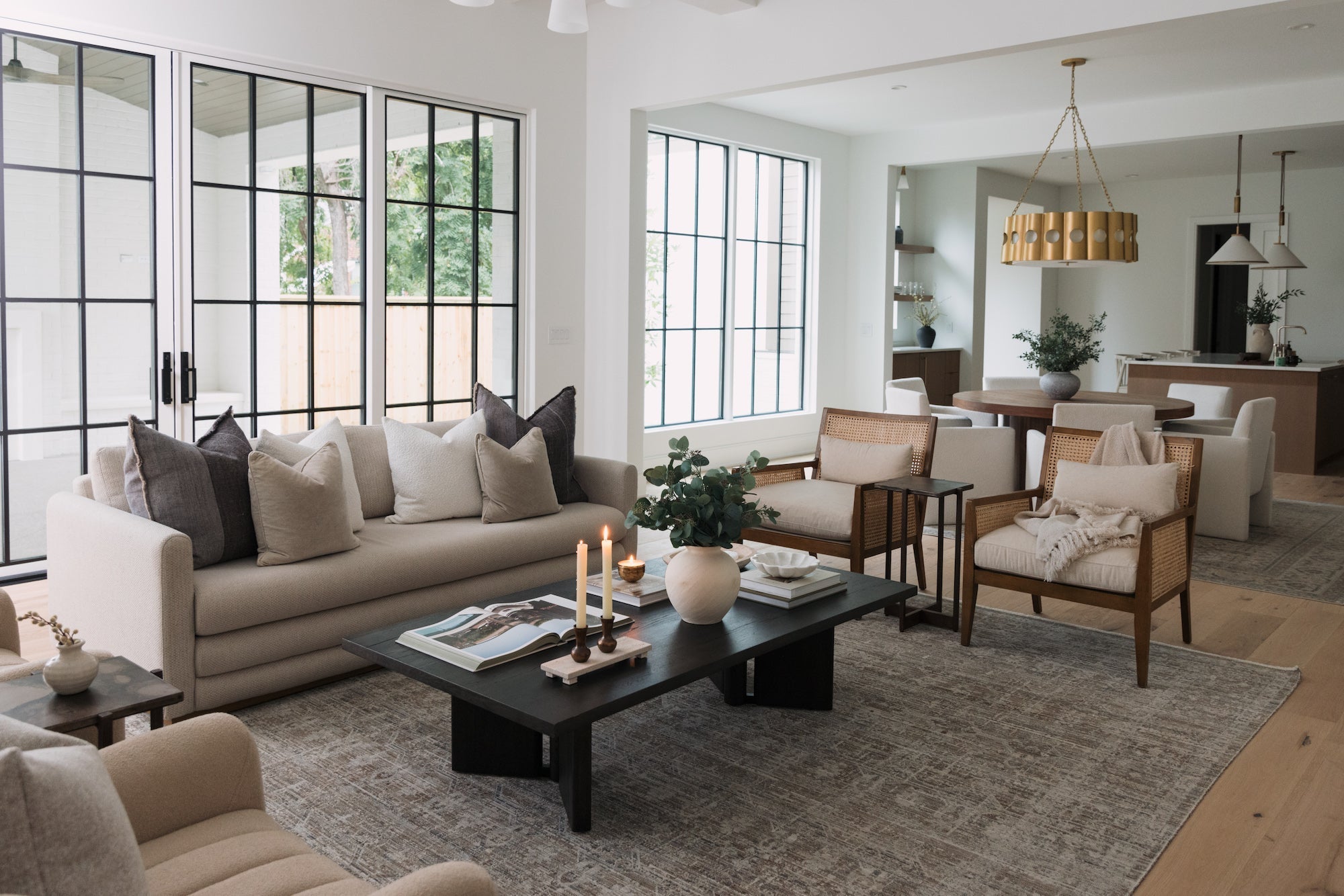
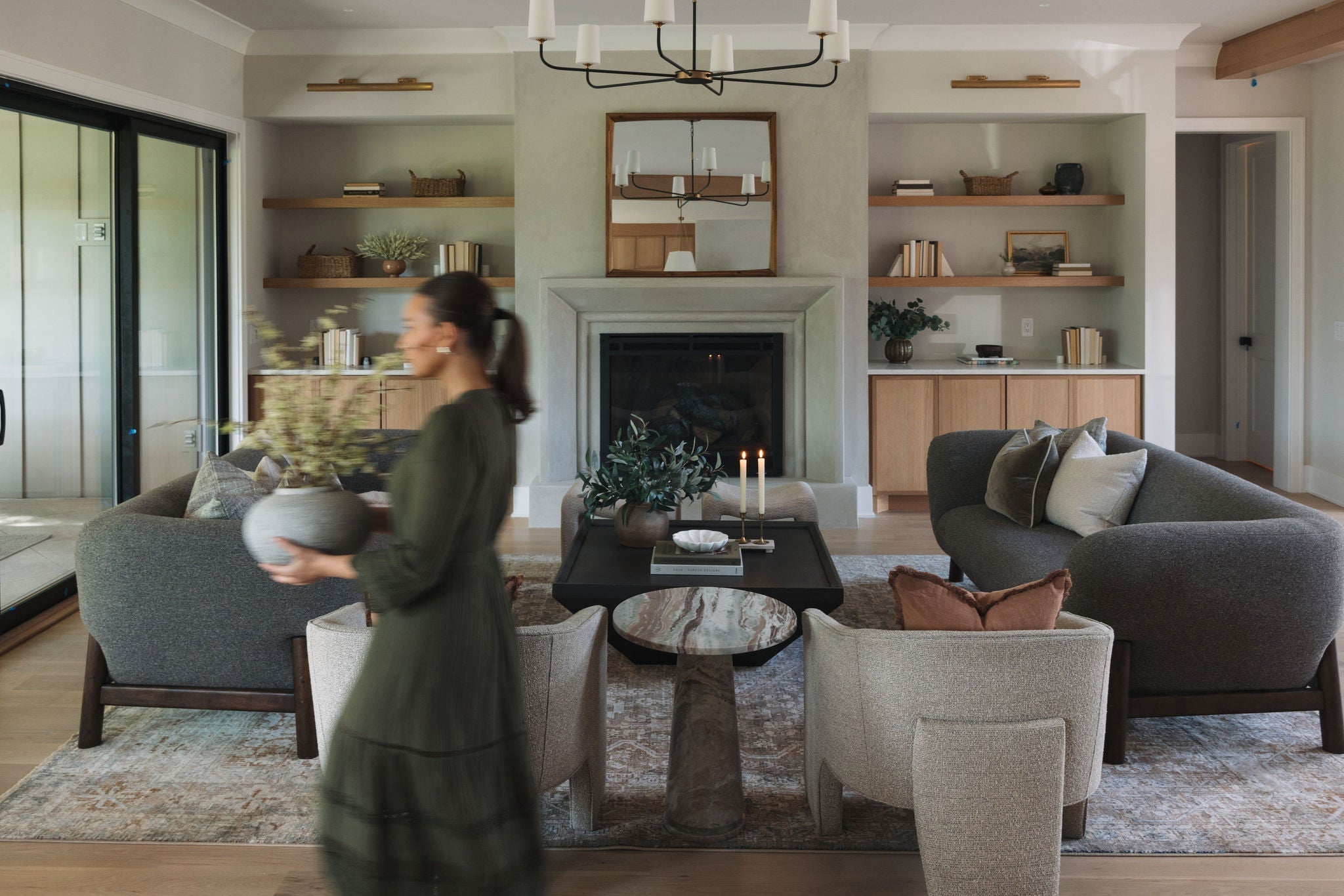
Every space needs a grounding element—something to orbit around. That might be a saturated wall color, a statement rug, or the undertone of your hardwood floors. Once your “hero” is clear, build supporting tones that echo or contrast with intention.Try a three-part palette:
- The base (your walls, floors, largest furniture)
- The support (upholstery, case goods, secondary tones)
- The accent (lighting, textiles, artwork)
It’s less about matching, more about rhythm.

3. Don’t Fear Saturation—Just Use It Strategically
Color doesn’t have to whisper. Sometimes, it can hum or even sing.
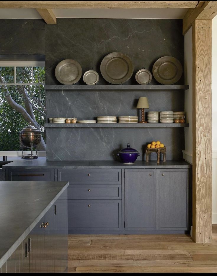
Color drenching—where walls, trim, and ceilings are painted the same tone—is one of the most transformative techniques in design right now. It cocoons a space and lets color become architectural. It works beautifully in bedrooms, libraries, and powder rooms, particularly when paired with tonal drapery or upholstered pieces.
The key: choose a hue that has depth without shouting. Think rust, eucalyptus, or stormy blue. Then keep the finish soft—matte or eggshell over gloss.

4. Use Color to Zone (and Connect) Spaces
Especially in open-plan homes, color helps define function. A rich olive in the dining area creates intimacy. A warm white in the kitchen feels fresh. A soft black in the mudroom grounds a high-traffic zone.But zoom out. A well-considered home palette isn’t just room by room—it’s whole-house storytelling. Repeating tones across rooms (in art, textiles, or finishes) ties spaces together without matching. It’s choreography, not repetition.

5. Elevate the Everyday Through Layering
One of the most overlooked ways to introduce color is through materiality. A room doesn’t have to be painted bold to feel rich in tone.Think:
- Buttery camel leather
- Oxidized brass
- Clay-toned linen
- Indigo-glazed ceramics
- Charcoal boucle
Layering tone through texture adds sophistication and softness, especially when working with neutrals.
Design by Clements Design
6. Let the Light Shape the Final Word
Every color lives differently depending on the light. What feels like a quiet sage in morning light may skew mint by night. Always test paint on the wall—at least two coats, across a few days. Tape swatches near trim, next to your furniture, and in the corners where light fades.
Good color doesn’t perform on command. It evolves. Sit with it.

Color is Clarity
Designing with color isn’t about being bold. It’s about being clear. Clear about what you want to feel, how you want to live, and what your home should support. When you choose color with care, the result is always personal—sometimes subtle, sometimes expressive, but always honest.After all, the best-designed spaces don’t just look good. They feel like you.